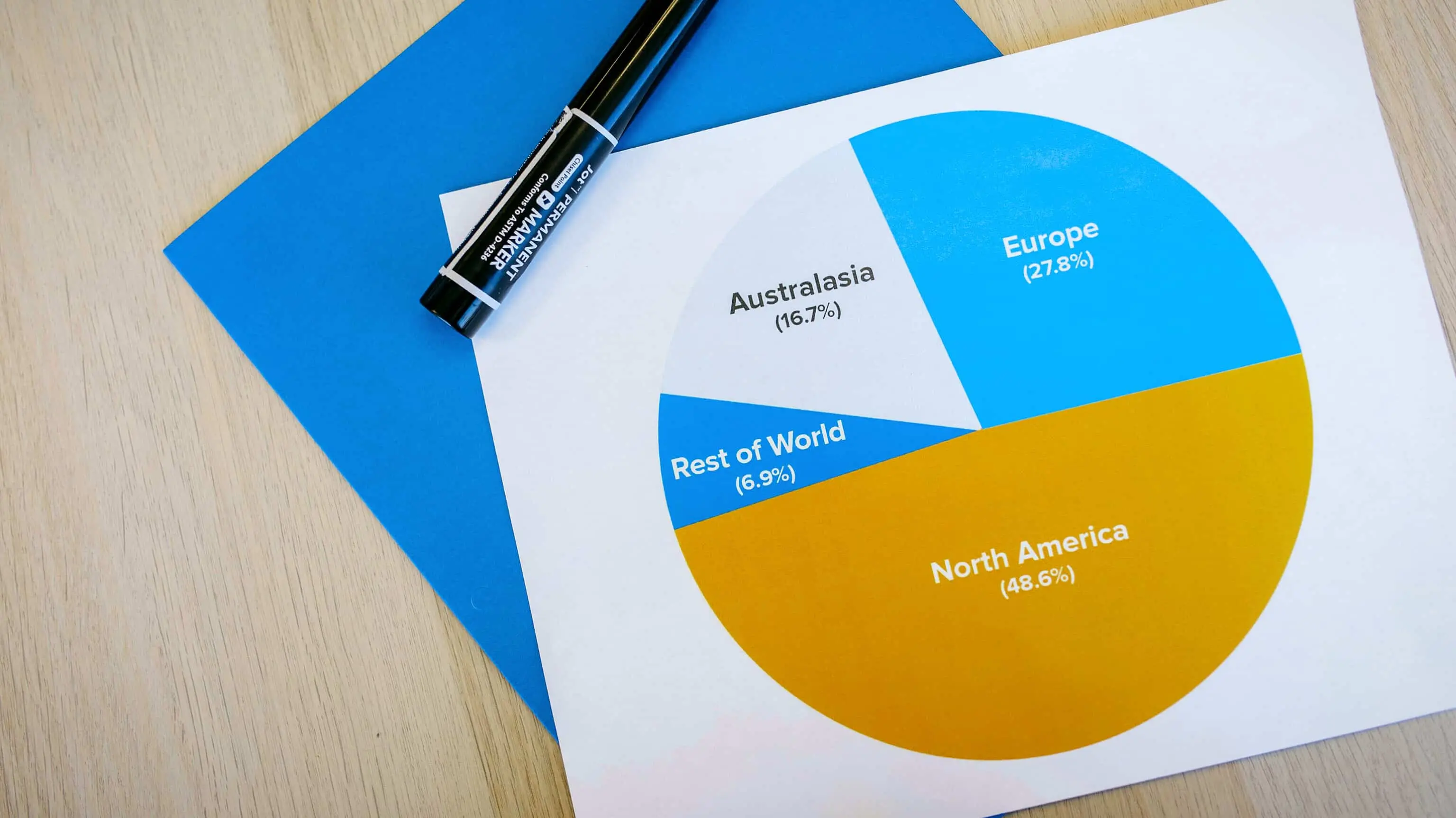
Introduction
Pie Charts are often our first foray into data visualization. You plug in a few values, get some colorful slices, and voilà! A masterpiece, right?
Well… not quite.
Despite being the go-to visual tool for everything from board meetings to school projects, pie charts are often misused, misunderstood, and downright abused. And if you're guilty of turning your data pies into abstract art (you know who you are), don't worry, you're not alone.
In this guide, we’ll expose the top 10 pie chart design mistakes people still make in 2025 plus we'll show you how to dodge these pitfalls, and introduce you to a handy tool, Pie Chart Maker, that makes it nearly impossible to mess up.
1. Overloading Your Pie with Too Many Slices
Sure, more slices sound better you know, more data, more insight, right? Not really.
When a pie chart has more than 6-7 categories, it starts looking like a Jackson Pollock painting. Tiny slivers are hard to read, and your audience ends up squinting instead of learning.
Fix: Group minor categories into an "Other" slice. Better yet, use a bar graph for complex datasets. Need help? Just drag and drop your data into Pie Chart Maker.
2. Using Similar Colors for Adjacent Slices
Nothing screams "I don’t care about readability" like painting all your pie slices the same shade of blue.
Fix: Use distinct, contrasting colors. Our Pie Chart Creator comes with a smart color palette generator. It automatically generates one for you plus it gives you the option to customize colors according to your need.
3. Ignoring Percentage Labels (Or Worse, Misplacing Them)
You know what's fun? Trying to guess if that green slice is 23% or 38%. It’s like playing Jeopardy, but with charts.
Fix: Always label your slices clearly. The Pie Chart Maker lets you toggle labels on/off in one click.
4. Going 3D When You Really, Really Shouldn’t
3D pie charts distort the proportions, trick the eye, and are generally hard to read. It’s style over substance and not in a good way.
Fix: Stick to flat, 2D charts.
5. Not Sorting Your Data
If your pie slices are all over the place, readers have to work harder to find meaning.
Fix: Sort your data from largest to smallest slice. Structure matters!
6. Using a Pie Chart for Trend Analysis
Let’s be honest - pie charts are not time travelers.
Fix: Use line graph maker or bar chart maker for trends. For help, visit eazyBI's guide.
7. Adding Too Many Decorative Elements
Drop shadows, bevels, neon borders… unless you’re designing a club flyer, tone it down.
Fix: Clean labels, clear colors, simple design. Tools like Pie Chart Generator are built with that in mind.
8. Forgetting the Chart Title (Or Writing a Vague One)
If your chart says “Revenue Breakdown,” that’s okay. But if it says “Q1 2025 Revenue Breakdown by Department, North America,” now we’re talking!
Fix: Be specific with titles.
9. Not Explaining the Data Source
People trust charts more when they know where the numbers come from.
Fix: Always mention your data source. It's good for trust.
10. Not Testing How It Looks on Mobile
Most folks view charts on their phones. A beautiful desktop pie can become a pixelated mess on smaller screens.
Fix: Always test on mobile. Our Pie Chart Maker is mobile-optimized.
Why Pie Charts Still Matter
Some might argue pie charts are outdated. But you know what else is “old”? Chocolate chip cookies. And yet, they’re still awesome.
Pie charts are visual comfort food. They’re easy to digest (pun intended), universally understood, and perfect for simple, clear data representation.
Conclusion
Now that you know these 10 pie chart design mistakes, it will be easier for you to fix than assembling IKEA furniture.
The key takeaway? Simplicity and clarity win. If you respect the chart’s limitations and design with intention, your data will shine.
Try out Pie Chart Maker. It’s free, easy, and won’t judge you for your past chart crimes.
FAQs
- Can pie charts be used for all types of data?
Nope. They're best for showing proportions. Avoid them for time series or comparisons. - What’s the ideal number of slices in a pie chart?
Between 4 to 6. Any more, and it gets messy. - Why do 3D pie charts get such a bad rap?
They distort the data and make it harder to compare slices. - Can I use Pie Chart Maker for commercial projects?
Absolutely! It’s free and supports commercial use. - How do I embed my pie chart into a website?
Use the “Embed Code” feature on Pie Chart Maker — it’s super simple. - What’s the biggest pie chart mistake ever made?
Probably using 12 nearly identical shades of green… in 3D… with no labels. Don’t be that person.