Introduction: The Most Misunderstood Chart in Data Visualization
Let's be honest—if charts had personalities, the pie chart would be that friendly neighbor everyone secretly makes fun of. You know the joke: "Pie charts are the worst." And to be fair, they do get roasted a lot in data circles. Some experts even treat them like the Comic Sans of data visualization. But here's the twist: pie charts aren't actually bad. They're just... misused. A lot.
Pie charts have earned a questionable reputation thanks to messy designs, too many slices, wild color palettes, and those 3D versions that look like someone tilted the chart off a table. But despite all the criticism, the pie chart still appears everywhere: business reports, school presentations, news graphics, dashboards—you name it.
So instead of joining the roast, this article flips the script. You're about to learn exactly when pie charts are the smartest, clearest, and most effective choice for your data. And trust me—there are moments when they shine.
Welcome to Data Visualization 101, where we give pie charts the redemption arc they deserve.
Why Pie Charts Are Hated — And Why That's Not the Full Truth
Pie charts have been publicly criticized by data visualization legends like Edward Tufte and Stephen Few. Their biggest complaints?
- People add too many slices
- Tiny differences are impossible to compare
- Designers use 3D effects that distort shape
- Colors clash or confuse viewers
- Labels get messy and unreadable
The truth is, these experts aren't wrong. Most bad charts are bad because of how they're designed—not because the pie chart itself is flawed.
Think of it this way: a hammer isn't a bad tool. But if you use it for everything—even tasks where it makes no sense—you end up with problems. Same for pie charts.
So, the real question is: When do pie charts actually work?
The Science Behind Pie Charts: How Our Brains Read Them
Humans read visual information through patterns, shapes, and proportions. According to research in visual perception, we're particularly good at instantly identifying dominant shapes, which is why pie charts can be powerful when one slice is clearly larger.
Our brains process:
- Angles
- Curved shapes
- Relative size
- Color association
This is why pie charts work better for showing a big winner, rather than showing small differences. If your data story is "This one category stands out," our minds grasp it instantly.
Simply put: pie charts don't help us measure—they help us recognize.
When Pie Charts Actually Work Best (The Golden Rules)
Let's break down the moments when pie charts truly shine.
When You Have 2–4 Categories Max
Fewer categories mean clearer insights. A pie chart with two or three slices is practically foolproof.
Example use cases:
- Market share between 2–3 top competitors
- Distribution of "Yes vs No" responses
- Device usage: mobile vs desktop
- Returning vs new users
With only a few slices, your audience doesn't have to work hard to interpret what they're seeing.
When One Category Dominates the Story
If one slice is 50%, 60%, or even 80%, your message becomes visually obvious.
For example:
- A budget where one department uses most resources
- Customer satisfaction where people overwhelmingly vote "Very satisfied"
- Website traffic where mobile devices dominate
When one category is the star of the show, a pie chart is basically a spotlight.
When You Want to Show Percent-of-Whole (Not Trends)
Pie charts are great for showing composition, not change over time.
Perfect for:
- Survey responses
- Product category distribution
- Budget allocation
- Audience segments
But don't use pie charts to show how things changed across months or years. That's where line charts or bar charts shine.
When Simplicity Is the Goal
Let's face it: not everyone loves data.
Pie charts are easy to understand at a glance, which makes them ideal for:
- Executive presentations
- Marketing reports
- Classroom dashboards
- Non-technical audiences
If clarity and quick interpretation matter more than precision, pie charts win.
Real-World Situations Where Pie Charts Are the Best Choice
Here are scenarios where pie charts consistently work:
- Budget breakdowns (e.g., marketing, operations, development)
- Market share snapshots for top competitors
- Survey results like satisfaction ratings
- App analytics (new vs returning users)
- Email analytics (opens vs unopened)
These examples all share one thing: a small number of clear categories.
When Not to Use a Pie Chart
Even the biggest pie chart fan would agree—some situations are no-go zones.
Avoid pie charts when:
- You have too many categories
- Slices differ by tiny percentages
- You need precise comparisons
- You're comparing multiple pies side-by-side
- You're showing trends over time
Better alternatives include:
- Bar charts
- Stacked bar charts
- Treemaps
- Line charts
If you're unsure, a bar chart is usually the safest backup plan.
How to Make an Effective Pie Chart (Design Best Practices)
Keep Slices Under 6
More slices = more confusion. Less is always more.
Use Clear Labels and Contrasting Colors
Good labels prevent guessing. High contrast keeps everything readable.
Start at 12 o'clock and Order Slices by Size
This improves flow and consistency across reports.
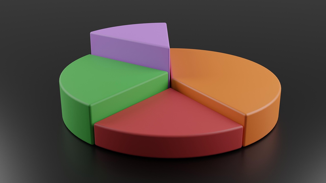
Avoid 3D Pie Charts—Always
They distort angles and kill accuracy. Even Edward Tufte would sigh.
Add Callouts When Highlighting Specific Insights
If one slice matters more, make it visually stand out using:
- Callouts
- Highlight colors
- Slight separation
Just don't overdo the dramatic flair.
Pie Chart vs Donut Chart: Which One Should You Use?
Donut charts are essentially pie charts with a hole in the middle. The hole reduces clutter and gives the chart a cleaner, more modern look.
Use donut charts when:
- You want to emphasize the total value
- You want room for a number or label in the center
- You're aiming for a minimalist dashboard style
If you want to create clean, professional donut charts easily, you can use a donut chart maker.
Pie charts, however, feel more traditional and can be easier for some audiences to read. Both are fine—just use them intentionally.
Tools That Create Great Pie Charts (Beginner-Friendly)
You can make clean, professional pie charts with:
- Excel (classic and reliable)
- DataViz Kit (free and easy to use)
- Google Looker Studio (great for dashboards)
- Tableau (powerful and visual)
- Power BI (corporate favorite)
- Canva / Figma (beautiful presentations)
For quick, professional pie charts without the learning curve, try our Pie Chart Maker.
Conclusion: Pie Charts Aren't Bad — Bad Pie Charts Are
Pie charts don't deserve the hate they get. When you use them with intention—few categories, clear slices, strong visuals—they can communicate information faster and more intuitively than many other chart types.
So don't throw out the pie chart. Use it wisely. Use it purposefully. And remember: in data visualization, the right chart is the one that tells your story best.
Ready to create effective pie charts? Try our Pie Chart Maker today—it's free, easy, and helps you follow all the best practices we've discussed.